Despite the best intentions, people do judge books by their covers.
It’s human nature.
We’re visual creatures, and we process life through imagery more so than words. That’s why companies make commercials and employees get headshots.
Blog articles are not exempt from this reality.
During the age of digital distraction, blog articles must earn their readers through captivating visuals. After all, blog articles are in direct competition with TikTok, YouTube, and the army of apps vying for our attention.
In other words, blog images are much more than an afterthought to your carefully-crafted content.
They’re a strategic tool that shapes the perception of your brand and drives audiences to interact with your content. Said more directly, when done right, blog images give readers a compelling reason to click through, read on, and explore what comes next.
In the sections below, we will unveil the psychological power of images, the reason B2C brands outshine B2Bs, and the ten best practices to align your blog visuals with your brand.
What the Data Says
According to neuroscientists at MIT, the human brain processes entire images in just 13 milliseconds—60,000 times faster than words.
That’s great news for your business, but only if you leverage it.
Even the best writing needs visual support. Strong visuals significantly improve the chances your audience sticks with your article to the end. Without it, readers could potentially lose interest, even with compelling and value-driven copy.
The statistics—some historical, some new—highlight the challenge of keeping attention:
The average time spent reading a blog article?
52 sec.
The percentage of readers who skim blog articles?
43%
The average amount of words consumed?
28%
With attention spans under siege, blog articles with visual imagery have an opportunity to seize the day.
In fact, adding visuals to long-form content dramatically improves search engine optimization (SEO), ignites a 94% jump in viewership, and even increases conversions by 80%.
Photos, illustrations, and other images aren’t just icing on a content cake. When it comes to blogs, they’re the cake itself.
How Visual Imagery Influences Decision Making
People are emotional, not rational.
As social psychologist Jonathan Haidt describes: “The emotional tail wags the rational dog.” In other words, while we think we’re thinking, we’re probably just feeling.
Though words influence feelings, images are uniquely capable of captivating the soul.
That’s why movies (not books) make billions of dollars a year—and why millions of people travel to see the Mona Lisa each year (not a first edition Dickens novel).
There’s a term for this phenomenon: The picture-superiority effect (PSE). As developed by psychologist Allan Paivio, the PSE asserts that images are significantly more memorable than words.
But why?
Because images engage multiple neural networks at once. While words generate a single verbal label with a literal meaning, visuals unlock a verbal label along with multiple tiers of symbolic meaning.
It’s like the extra-dimensional difference between seeing life in color versus black and white.
Speaking of sight, visual stimuli is processed by special photoreceptors—eye cells that convert light into electrical signals sent straight to the brain. Along the way, these photoreceptors engage the amygdala, the brain’s emotional hub.
Once the amygdala lights up, even the most fleeting images get baked into a viewer’s memory. And despite their complexity, these treasure troves of stimuli are processed faster than words alone.
Beware: Images wield untold power. While visuals can have positive effects for your blogs and business, they can also trigger negative outcomes.
Every picture will unleash countless associations in the minds of your viewers—most of which are subconscious. Therefore, every detail matters, including the photo’s color palette, lighting, framing, and composition.
Where B2C Blogs Outshine B2Bs
“Good artists copy—great artists steal.”
Pablo Picasso’s infamous perspective is useful for B2B companies in the blogosphere.
What should they “steal”? The human-centric storytelling of their B2C counterparts. After all, it’s B2Cs that value emotive visuals over sterile imagery.
Conversely, most B2Bs are stuck in blind adherence to the drab visuals of corporate America.
We get it. When everyone else is doing something, running against the crowd feels sacrilegious.
Nevertheless, most B2B blog articles look identical with stock photos of generic skylines, colorless boardrooms, and cliched handshakes.
Though undeniably “professional,” these images are also thoroughly devoid of life. Instead of igniting the human spirit, they extinguish it.
By contrast, B2C imagery teems with humanity. The visuals are colorful, uplifting, and capture life in media res (in the middle of things).
See how Uber introduces this blog article? The “case study” title smacks of corporate jargon, but the lead image captures two passengers in an undeniably authentic moment. It feels real.
The rest of the article reinforces that emotion with substance.
Supporting visuals like service area maps and booking screens bring clarity and value to the reader. Together, the human-centric hero image and the technical visuals work in tandem to tell a complete, compelling story
As a counterpoint, take a quick look at this Salesforce blog article.
Here, we find a digital rendering of a person studying a book, hunched over in profile view with a purple coffee mug slightly out of reach. It uses a familiar illustration style, one that’s become so ubiquitous across tech that it’s lost much of its meaning and impact.
Is Salesforce a tech company? Yes.
Is their blog technically focused? Yes.
Shouldn’t Salesforce’s images look technical? No.
While you could argue that the image is technically “on brand,” it feels generic and emotionally flat. It doesn’t add depth to the message, spark curiosity, or reinforce any unique visual identity.
In cases like this, it’s worth asking: if the image isn’t adding value, why use one at all?
Remember, whether you’re selling software to businesses or shoes to athletes, you’re always dealing with human beings. Algorithms may be the intermediaries, but it’s people who make conversion decisions. There is no exception to that rule.

Brand Alignment: Choosing the Right Imagery for Your Blog
Your blog is an extension of your brand, not a standalone web page.
This is important for businesses to understand. Though your blog may not be the marquee attraction of your website, it’s still an integral part of the user experience.
When people want to see what you do, they scroll through your products and services pages. But when they’re curious about how you think, they read your blog.
Therefore, your blog must match your brand’s messaging and visual personality.
At CSTMR, we refer to visual personality as “how your company feels.” It’s the sum of emotional parts—the styles, colors, fonts, and images—that fire up the amygdala.
If your visual personality remains vague or unremarkable, asking two quick questions will help you build clarity:
1. What Emotions Do You Want Your Brand To Evoke?
Inspiration? Luxury? Safety? FOMO?
All of the above?
There are no wrong answers so long as you’re intentional with your choices. While great brands can be emotionally provocative, most aren’t by default. In fact, many miss the opportunity to evoke anything at all.
That’s why clarity around your brand’s emotional intent—and how it manifests visually—is so important. It is here where strategy and design combine to shape and express those emotions in a way your audience can actually feel.
Start by identifying the emotional response you want your audience to have, and make that the foundation for your brand’s visual language.
2. What Type of Images Inspire Those Feelings?
If your blog were an art gallery, what visuals would you hang on the walls?
Maybe your visual personality aligns best with lifestyle photography. Maybe abstract visuals and designs leave more to the imagination. Or, maybe you forego photos and hire a designer to produce custom illustrations.
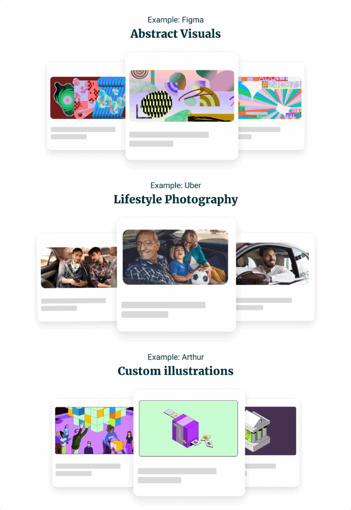
Whatever the choice, consistency is key. Without it, your brand becomes harder to recognize, and recognition is a critical building block of trust. The more consistently your audience sees your brand expressed across content and channels, the more likely they are to remember it, understand it, and trust it.
Far too often, blogs dilute their commitment to a visual brand style and confuse customers along the way. Imagine the cognitive dissonance of an opera with dance music at intermission. That’s what mismatched visuals will do to your brand.

It’s also important to remember that visual style isn’t the substance of your brand, it’s how that substance is expressed. The real substance lives in your values, positioning, and personality. Style brings that to life in a way your audience can feel at a glance.
Example: Monzo has a unique style to their brand that continues through the blog. Using a signature color, font and illustration style reflects its commitment to making financial services more accessible and human.
Blog Imagery Best Practices
Ready to elevate your blog visuals?
We’ve got you covered.
With these blog visual best practices, you’ll gain an end-to-end framework to jumpstart the process.
1. Prioritize the Feature Image
Every blog picture is important, but only one is essential: The feature image.
The feature (or “hero”) is the first impression on social media and Google search. It’s the neon sign that draws viewers to your establishment.
If it’s eye-catching, it wins a click—anything less gets abandoned.
That’s why the feature image deserves the lion’s share of your attention, even if that means investing in custom graphics to make it truly unforgettable.
2. Maintain Contextual Relevance
Matching images to text requires artistry and restraint.
It’s easier said than done. For example, try to think of an appropriate visual for the following:
“5 Ways to Boost Social Media Engagement.”
If we pursued a literal match, we might use an image of a person scrolling on a smartphone. But that would be a bit obvious.
What about a crowd of people giving a “thumbs up” of approval? Too generic.

Indeed, it’s possible for blog images to insult an audience’s intelligence. That’s why it’s so important to be tactful with the images you deploy, matching the visual to the message while also leaving room for imagination.
We mentioned the Mona Lisa earlier, and there’s a reason she remains so popular. She wears an enigmatic expression, and blog images would do well to preserve some of that mystery.
3. Place Images Strategically
Flow is important in any successful blog article.
As we have seen, readers are more distracted than ever, and it’s a miracle if they complete a blog article in a single sitting.
While images can enhance flow by punctuating a section break, they can also interrupt it if added to the wrong places.
Be strategic with the marketing visuals you employ, and never use them as a crutch to overcome subpar writing. Fix weak content first, then see where visuals are needed.
Fact: All websites are built to guide the reader’s eyes to a desired destination (typically a CTA). Anything that helps that process is valuable, while anything that hinders it must be jettisoned.
4. Stay Consistent In Style
Memorable brands adhere to a single visual style.
Think Coca-Cola’s red-white color scheme, Nike’s “swoosh,” and Apple’s minimalism.
In the digital space, it’s better to be a master of one visual style than an amateur with competing aesthetics.
Whether you pick illustrations over photography, vibrant colors over earth tones, or Helvetica over Papyrus—stick with it (unless it fails to sustain audience engagement).
Inconsistency dilutes your brand. Visual style works best when it’s applied consistently, reinforced across touchpoints, and treated as a long-term commitment, not a case-by-case design choice.
5. Be Selective With Stock Photography
Stock photos can work well, especially if edited to fit your brand: adding logos, adjusting colors, or cropping thoughtfully.
Nevertheless, the majority of stock photography is overused and inauthentic. Just search for “happy people stock photo” and marvel at the abundance of fake smiles and forced poses.
As a general rule, avoid stock images that appear on the first pages of free-to-use sites like Unsplash or Pexels. Nothing cheapens a blog article faster than an image your readers have seen on other sites.
If your budget allows, capitalize on premium stock photo agencies like iStock, Shutterstock, and Adobe, then customize them with your brand hallmarks.
6. Visualize Data-Heavy Content
To engage readers, technical blogs need visuals.
That’s especially true for fintechs and financial companies, where numbers play a key role in communications.
Wherever possible, convert statistics into visually-appealing charts and infographics.
You don’t need to change your writing at all. Instead, simply convert choice sections into standalone graphs and images.
With performance-related topics, use before-and-after comparisons. For step-by-step guides, create flowcharts and diagrams (rather than writing out each step in a lengthy paragraph).
If it helps, imagine your blog articles as a piece of music, and seek opportunities to change rhythm.
7. Don’t Overlook SEO Optimization
When it comes to earning traffic, keywords are only one of your weapons.
In addition to text, Google and other search engines will index your images.
That’s why custom visuals are so powerful. If they’re truly unique, they’re more likely to attract a new audience.
Images boost SEO.
While optimizing photos may sound time-intensive, it’s surprisingly easy to do:
- Use keyword-rich file names that align with the theme of your images (and make them discoverable in search)—“guide-to-SEO.jpg” works better than “image1.jpg”.
- Incorporate alt text—the description of an image that averages 150 characters or less. Alt text helps search engines index your images, which in turn helps you attract new clients.
- Resize and compress your images. This preserves the quality of your visuals while maximizing page load speed, SEO rankings, and user experience (UX).
All in all, optimizing a photo takes less than a minute to maintain your standing in search.
Resource: Semrush has a fantastic guide on SEO image optimization.
8. Prioritize Mobile-Optimization
Nearly 63% of all web traffic comes from mobile devices.
Smartphones dominate searches, and your blog must be ready to welcome visitors.
Unfortunately, many blogs lack proper mobile optimization. As a result, readers are greeted with distorted imagery, laggy loading times, and a subpar UX.
To avoid these scenarios, you must ensure that your blog is optimized for all devices: Desktops, laptops, tablets, and smartphones.
These three rules provide a reliable foundation:
- Use a responsive theme that automatically adapts to various screen sizes.
- Optimize image file size and dimensions to ensure they look sharp on high-res screens while still loading quickly on both desktop and mobile (something that is consistently overlooked).
- Enable lazy loading so images only load as users scroll, improving page speed and reducing load strain on mobile connections.
- Test your blog across multiple devices to deliver a seamless UX for visitors.
While your business may have one URL, it’s helpful to think of having two websites: one that appears on desktop computers, and another that populates on mobile devices.
9. Cleverly Integrate Call-to-Actions (CTAs)
Don’t forget the ultimate purpose of your blog: Educate, attract, and retain clients.
Therefore, every element of your blog should drive readers towards conversion—via call-to-action (CTA) buttons, lead magnets (like an eBook), or product links.
How do you know when and where to add CTA images? Whatever feels natural.
Put yourself in the shoes of your readers. If your CTA feels jarring to you, your guests will probably agree.
Remember: Your content creates a need that positions you to provide a solution. Be patient, let your writing “breathe,” and avoid inserting ads too early in the blog article.
Note: Use visual cues that guide your reader to conversion. This might include arrows, infographics, and even images of people looking in the direction of your CTA.
10. Audit and Adjust Regularly
Your blog is fluid—not fixed.
Though consistency remains the ideal, you’re always allowed to evolve. To that end, only be consistent with what consistently works.
Experimentation is necessary to learn what resonates with your target audience, and there’s plenty of technology to help you find answers.
For example, A/B testing visuals will help you get optimized, as will tools like Hotjar and Google Analytics, which track engagement via click-through rates and scroll depth.
Note: If you’re underwhelmed with blog engagement, it may be time to revise your content strategy and visual personality.
Transform Your Blog, Transform Your Brand
In the digital age, blog images are critical for retaining reader interest.
Beyond mere decorations, the visuals you deploy are strategic tools that boost SEO, engage readership, and drive conversions.
If you’re in the B2B world, don’t be afraid to take a page from the B2C playbook. Leveraging authentic and emotional visuals is a proven pathway to winning new clients.
Above all, remember that your blog is an extension of your brand identity. As such, the imagery you use must reflect the messaging and style that defines your business in the public square.
Ready to captivate your audience? Schedule a call with us to build a blog (and a brand) that stands the test of time.